Clustering basics
This ipynb is based on a workshop organised by the tech consulting company TNG. The notebook explains the theoretical background of three widely used clustering algorithms and uses them on some sample data. As a final example, clusters are used to ‘‘discretise’’ the colours of an image.
import numpy as np
import seaborn as sns
import matplotlib
import matplotlib.pyplot as plt

#from plotting_utilities import *

from sklearn.datasets import make_moons, make_blobs
from sklearn.cluster import KMeans, DBSCAN, SpectralClustering
from PIL import Image
import requests


%matplotlib inline
/usr/lib/python3/dist-packages/requests/__init__.py:91: RequestsDependencyWarning: urllib3 (1.26.7) or chardet (3.0.4) doesn't match a supported version!
  RequestsDependencyWarning)
Toy Datasets
These datasets will be used in the rest of the notebook to compare clustering algorithms.
n_samples = 500
datasets = {"EqualBlobs": make_blobs(centers=[[2, 2], [-2, -2], [-3, 3]], cluster_std=[0.5, 0.5, 0.5], n_samples=n_samples),
            "UnequalBlobs": make_blobs(centers=[[2, 2], [-2, -2]], cluster_std=[0.5, 2.5], n_samples=n_samples),
            "Moons": make_moons(n_samples=n_samples, noise=.05, random_state=0)}
plt.scatter(datasets['EqualBlobs'][0][:,0],datasets['EqualBlobs'][0][:,1])
plt.show()

plt.scatter(datasets['UnequalBlobs'][0][:,0],datasets['UnequalBlobs'][0][:,1])
plt.show()

plt.scatter(datasets['Moons'][0][:,0],datasets['Moons'][0][:,1])
plt.show()


1. Clustering algorithms
Task: For KMeans and DBScan, apply the algorithms to the three toy datasets (use scikit learn). Visualise the results to assess whether the algorithm is working well. Try different parameter values to see how it influences the results.
def MakeLabels():
    global labels_EqualBlobs, labels_UnequalBlobs, labels_Moons

    ## Fill following variables with the results of the DBScan clustering for each dataset
    labels_EqualBlobs = None
    labels_UnequalBlobs = None
    labels_Moons = None
def ShowPrediction():
    global predicted_labels
    predicted_labels = {"EqualBlobs": labels_EqualBlobs,
                    "UnequalBlobs": labels_UnequalBlobs,
                    "Moons": labels_Moons}
def plot_dataset_and_clusters(datasets, predicted_labels):
    fig, axs = plt.subplots(1, len(datasets),figsize = (12,5))
    j = 0
    for i in datasets:
        axs[j].scatter(datasets[i][0][:,0],datasets[i][0][:,1], c = predicted_labels[i] )
        j+=1
    plt.show()
KMeans
Simple and used frequently as a first step: Randomly assign k cluster centres in the data and iterate:
- assign all data points to the nearest cluster centre
- compute the k new cluster centre as the centre of mass of the cluster
until the centres no longer move. By construction, this results in spherical clusters because of the L2-norm of the distance.
MakeLabels()
## SOLUTION ##
kmeans = KMeans(n_clusters=3, random_state=0).fit(datasets["EqualBlobs"][0])
labels_EqualBlobs = kmeans.predict(datasets["EqualBlobs"][0])

kmeans = KMeans(n_clusters=2, random_state=0).fit(datasets["UnequalBlobs"][0])
labels_UnequalBlobs = kmeans.predict(datasets["UnequalBlobs"][0])

kmeans = KMeans(n_clusters=2, random_state=0).fit(datasets["Moons"][0])
labels_Moons = kmeans.predict(datasets["Moons"][0])
ShowPrediction()
plot_dataset_and_clusters(datasets, predicted_labels)

If you have time, you can try applying a Gaussian mixture model to the same datasets.
The elbow method for K Means
inertia = []
for k in range(1,8):
    kmeans = KMeans(n_clusters=k, random_state=0).fit(datasets["EqualBlobs"][0])
    inertia += [kmeans.inertia_]

plt.plot(range(1,8), inertia);

inertia = []
for k in range(1,8):
    kmeans = KMeans(n_clusters=k, random_state=0).fit(datasets["UnequalBlobs"][0])
    inertia += [kmeans.inertia_]

plt.plot(range(1,8), inertia)
[<matplotlib.lines.Line2D at 0x7f292c465d30>]

inertia = []
for k in range(1,8):
    kmeans = KMeans(n_clusters=k, random_state=0).fit(datasets["Moons"][0])
    inertia += [kmeans.inertia_]

plt.plot(range(1,8), inertia)
[<matplotlib.lines.Line2D at 0x7f292c44c470>]

For the blobs with equal width, the elbow curve is very unambiguous. For the other two data sets, the curve is more of a continuum than a clear elbow.
DBScan
This algorithm is more tricky than kmeans. It uses a minimum distance epsilon and a minimum number of points min_samples and classifies the data points into groups:
- A point is a core point, if at least min_samples of points are in an epsilon-radius around it
- A point is reachable from a core point, if it is in an epsilon-radius around it
- All mutually reachable core points and their reachable non-core points are classified into the same cluster
- All points not reachable from any other point are outliers
Therefore, DBSCAN can
- Identify clusters with complicated shapes
- find outliers
- determine the number of clusters automatically
But the last two mechanisms depend on the choices for epsilon and min_samples.
Note that in the example, there are different eps-values for the different data!
MakeLabels()

dbscan = DBSCAN(eps=0.5, min_samples=5).fit(datasets["EqualBlobs"][0])
labels_EqualBlobs = dbscan.labels_

dbscan = DBSCAN(eps=0.7, min_samples=5).fit(datasets["UnequalBlobs"][0])
labels_UnequalBlobs = dbscan.labels_

dbscan = DBSCAN(eps=0.1, min_samples=5).fit(datasets["Moons"][0])
labels_Moons = dbscan.labels_
ShowPrediction()
plot_dataset_and_clusters(datasets, predicted_labels)

Spectral Clustering
Consider the data as a network of points that are connected to e.g. their k nearest neighbours. Then the Laplacian matrix (L_ij) is given by
- L_ii = number of connections between the ith data point and other points (the degree of the point; by construction k for the k nearest neighbours)
- L_ij = - 1 * Delta_ij: Delta_ij is 1 if i and j are connected and 0 otherwise
Different constructions of the network yield different Laplacians, e.g. by connecting any points with each other that are in an epsilon-radius-neighbourhood of each other. Spectral clustering computes the eigenvectors and -values of the Laplacian matrix. “The intuition of clustering is to separate points in different groups according to their similarities. For data given in form of a similarity graph, this problem can be restated as follows: we want to find a partition of the graph such that the edges between different groups have a very low weight (which means that points in different clusters are dissimilar from each other) and the edges within a group have high weight (which means that points within the same cluster are similar to each other).” (Taken from section 5 in http://www.tml.cs.uni-tuebingen.de/team/luxburg/publications/Luxburg07_tutorial.pdf)
If you have the Laplacian L, then
- calculate the m eigenvectors u_1,…,u_m of L with the smallest eigenvalues
- construct a matrix U = (u_1, …, u_m) with the eigenvectors as columns
- use k-means algorithm on the rows of U (ith row corresponds to ith instance in the original data)
MakeLabels()

spectral = SpectralClustering(n_clusters=3,assign_labels="discretize", random_state=0, affinity='nearest_neighbors').fit(datasets["EqualBlobs"][0])
labels_EqualBlobs = spectral.labels_

spectral = SpectralClustering(n_clusters=2,assign_labels="discretize", random_state=0, affinity='nearest_neighbors').fit(datasets["UnequalBlobs"][0])
labels_UnequalBlobs = spectral.labels_

spectral = SpectralClustering(n_clusters=2, assign_labels="discretize", random_state=0, affinity='nearest_neighbors').fit(datasets["Moons"][0])
labels_Moons = spectral.labels_

ShowPrediction()

plot_dataset_and_clusters(datasets, predicted_labels)
/home/users/t_wand01/.local/lib/python3.7/site-packages/sklearn/manifold/_spectral_embedding.py:261: UserWarning: Graph is not fully connected, spectral embedding may not work as expected.
  "Graph is not fully connected, spectral embedding may not work as expected."
/home/users/t_wand01/.local/lib/python3.7/site-packages/sklearn/manifold/_spectral_embedding.py:261: UserWarning: Graph is not fully connected, spectral embedding may not work as expected.
  "Graph is not fully connected, spectral embedding may not work as expected."

Application: color discretization
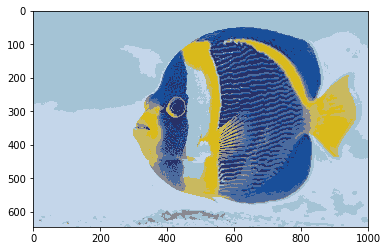
In current systems, colors are mostly represented with at least 24 bits (8 bits per primary color: red, green, blue). However, in older systems or when storage is very limited, colors can be compressed into space, for example by using only 3 bits (i.e. 8 different colors). In that case, which colors exactly are chosen makes a large difference in terms of image quality. One way is to choose the 8 colors independently of images. However, if the image(s) are available, it is possible to choose more representative colors, for example by using clustering on the pixel colors.
fish = np.array(Image.open(requests.get("https://i.imgur.com/NQbOVJE.jpg", stream=True).raw))
def plot_images(array):
    plt.imshow(array, interpolation='nearest')
    plt.show()

plot_images(fish)

Standard quantization with 3 bits (8 colors)
When arbitrary cluster representants are chosen, the image quality degrades sharply.
three_bit_colors = [(0,0,0), (0,0,255), (0,255,0), (255,0,0), (255,255,0), (255,0,255), (0,255, 255), (255,255,255)]
def cluster_3_bits(im):
    res = np.array(im)
    res[res<128]=0
    res[res>=128]=255
    return res
plot_images(cluster_3_bits(fish))

Quantization via clustering
Task: Using the clustering algorithm of your choice, find more representative quantizations for each image. In order for your image to be displayed properly, you may need to round the pixel values to integers.
def quantize_image_kmeans(im, ncolours):
    # takes array-version of an image as "im" and the number of colours ncolours
    shape=im.shape

    # transform to 1d array
    flattened = np.reshape(im, (shape[0]*shape[1], shape[2]))

    # clustering, i.e. discretising the image
    kmeans = KMeans(n_clusters=ncolours).fit(flattened)
    labels = kmeans.predict(flattened)
    quantized = kmeans.cluster_centers_[labels,:]
    return np.reshape(quantized, (shape[0], shape[1],3))
quantized_fish = quantize_image_kmeans(fish, 8)
plot_images(quantized_fish.astype(int))
# testing different resolutions of the quantisation
for n in range(2, 10):
    print("Discretised to "+str(n)+" colours")
    quantized_fish = quantize_image_kmeans(fish,n)
    plot_images(quantized_fish.astype(int))
Discretised to 2 colours

Discretised to 3 colours

Discretised to 4 colours

Discretised to 5 colours

Discretised to 6 colours

Discretised to 7 colours

Discretised to 8 colours

Discretised to 9 colours

Cluster silhouette
The silhouette method visualises how good a cluster assignment is, according to a given distance. Task: Evaluate the different clustering methods on the above datasets using the silhouette method. To obtain a nice visualization quickly, you can use the code in this tutorial.